The purpose of logo design
- Foundation of brand identity:
A logo is the foundation for shaping and defining your brand’s unique identity.
- Recognition/Attention:
An effective logo draws attention and generates instant recognition in the minds of your target audience.
- Implement brand loyalty:
A memorable logo builds trust, encouraging people to stay loyal to your company in the long run.
- Establish a mood/certain emotions:
A well-designed logo communicates emotions that resonate with audiences, establishing the tone for your business.
- Strong 1st impression:
An impactful logo makes a bold, favorable first impression, encouraging consumers to learn more.
History & Origin of Logo Design
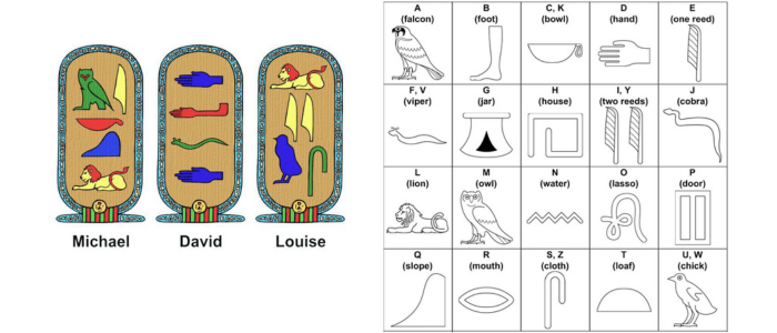
Logo design began in the 12th century BC when symbols were used to identify people, places, and objects. Early examples can be found in ancient Egypt, where hieroglyphs represented the identities, accomplishments, and divine positions of rulers and gods, serving cultural and religious purposes. These symbols conveyed power, authority, and belonging and were critical in preserving Egypt’s culture and heritage for subsequent generations.
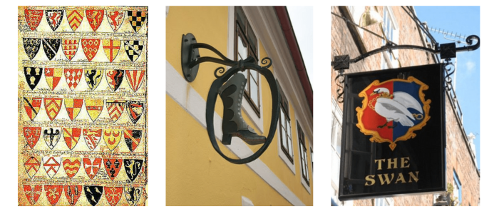
During medieval times, coats of arms and family crests emerged in Europe as unique and personalized symbols representing noble families and lineages. These intricate designs served to identify knights in battle, distinguish their heritage, and convey status, loyalty, and allegiance, fostering family pride and recognition across generations.
With the invention of the printing press in the 15th century, urbanization increased as people relocated to cities. Businesses began attracting consumers by displaying signs that identified shops and highlighted the products they offered, marking the start of commercial branding.
Most common elements used in Logo Design
-
Colours
-
Proportions
-
Typography
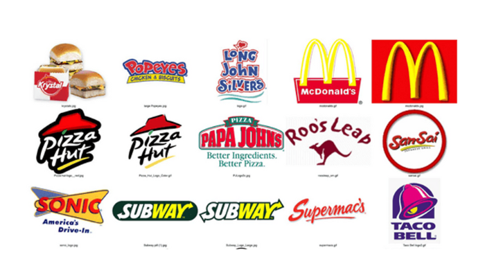
Customer Psychology towards Logo Color
Customer psychology regarding logo color is critical because colors trigger emotions, change perceptions, and shape brand associations. People subconsciously judge products within the first 90 seconds of seeing them. Every color has distinct meanings and generates diverse responses.
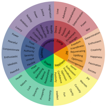
Here are some of the examples for logo colors:
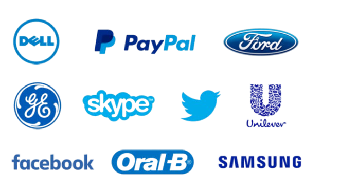
Blue: A calming, trustworthy color, blue conveys reliability, stability, and professionalism, making it a favorite in finance, healthcare, and tech industries.
Red: Often associated with energy, excitement, and urgency, red can grab attention and evoke strong emotions, commonly used for brands aiming to energize or stimulate action.
Impact of size & proportion in Logo- learning from NATURE
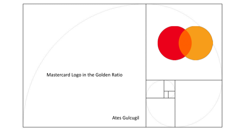
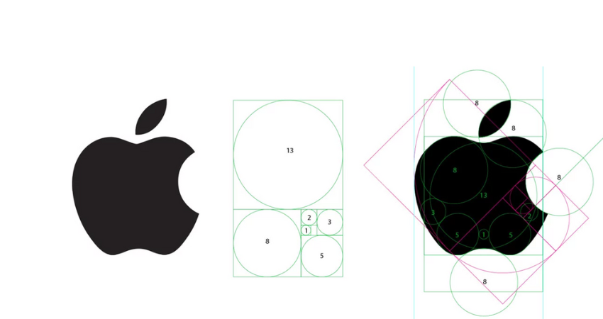
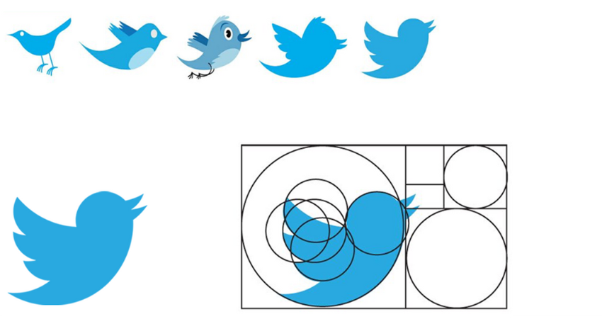
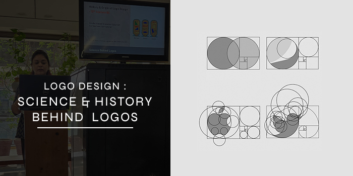
The golden ratio can be used to help determine the overall proportions of a logo. Designers frequently use it to divide a logo into portions or define its shape, ensuring that each component fits the total. For example, the height and length of parts could be adjusted to match the golden ratio, resulting in a well-balanced design.
Here are some examples:
Impact of TYPOGRAPHY
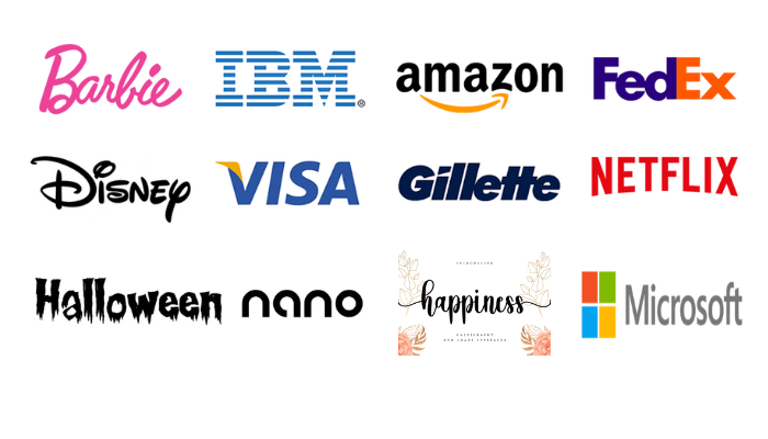
Different typefaces generate various emotions and behaviors, making typography an effective design tool. Typography not only differentiates a logo visually, but it also conveys the brand’s personality, values, and style. Serif typefaces (those with thin decorative lines or “feet” at the ends of letters) represent tradition, dependability, and authority, and are commonly used by established institutions or luxury companies. Sans-serif typefaces, which lack ornamentation, have a more modern, clean feel and are commonly linked with brands that wish to appear open, tech-savvy, or forward-thinking. Handwritten or script typefaces provide a personal, artisanal feel, implying originality, elegance, or intimacy, whereas minimalist, geometric fonts convey precision and efficiency.
In Conclusion
In the evolving world of logo design, simplicity, versatility, and emotional impact remain essential for creating memorable and effective logos. These elements ensure a logo not only looks appealing but also adapts seamlessly across platforms and resonates emotionally with audiences. A well-designed logo captures the brand’s essence, leaving a lasting impression in a competitive landscape. BRIM specializes in creating memorable brand identities that stand out, crafting logos that align with your vision and connect deeply with your audience.


