How Does Human Psychology Affect UI/UX Design and User Behavior?
In today’s digital age, user experience (UX) and user interface (UI) design play a critical role in how people interact with websites, apps, and other digital platforms. Understanding human psychology is a key element that influences the effectiveness of UI/UX design.

For businesses like those seeking a website design agency in USA, mastering these psychological principles is essential to crafting intuitive and user-friendly experiences. But how does human psychology shape UI/UX design and user behavior? Let’s explore.
1. The Role of Psychology in UI/UX Design
Human behavior is often driven by instinctive psychological triggers, and UI/UX design leverages these to guide users’ interactions with digital platforms. When creating a website, it’s not just about aesthetics but about understanding how users think, feel, and react. By tapping into these psychological factors, web design and development agencies can create user interfaces that are intuitive and lead to higher engagement.
For example, at Brim, we focus on using the psychology of visual hierarchy and color theory to ensure that users naturally navigate through our sites with ease, whether it’s for a real estate client or a luxury jewelry brand.
2. Cognitive Load and Simplifying Information
Cognitive load refers to the mental effort required to process information. Too much complexity can overwhelm users, leading to frustration or abandonment of a site. By reducing cognitive load, we can create websites that are easy to navigate, helping users find what they’re looking for quickly.
At Brim, we utilize minimalistic designs, focusing on clarity and simplicity to make sure that users aren’t bombarded with excessive choices. This keeps their experience smooth and enjoyable, ensuring they stay longer on the site and are more likely to engage with the content or product.
3. The Power of Visual Hierarchy
One of the most important elements of UI/UX design is creating a clear visual hierarchy. This involves arranging elements on the screen in a way that naturally guides the user’s attention. Whether it’s a call-to-action button, a headline, or an image, every element must be purposefully placed.
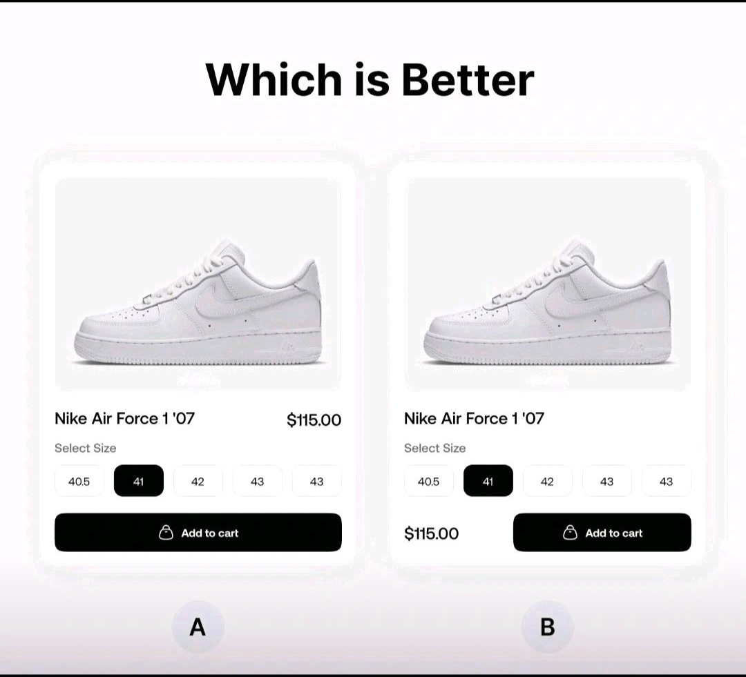
Option A is more compatible with human psychology since it follows the normal reading and decision-making flow, known as the “vertical hierarchy” of attention. The “Add to cart” button in Option A is placed directly below the size selection, which decreases mental burden by eliminating the need for users to shift their focus sideways or consider where to go next.
Option B, on the other hand, interrupts this natural rhythm by offsetting the button, which may result in a moment of doubt or misunderstanding, leading to dissatisfaction or decision fatigue. Option A makes use of human vulnerability to prefer simplicity and directness, making it more successful at guiding consumers through the checkout process.
For example, in one of Brim’s real estate projects, the website’s homepage leads with strong, bold visuals that immediately communicate luxury and quality, ensuring that users feel a sense of exclusivity as soon as they land on the page. By strategically placing key messages at the top of the page and using high-contrast colors for buttons, we direct users to take specific actions without overwhelming them.
4. The Importance of Color and Emotion
Colors evoke emotions, and understanding how certain colors affect user behavior is crucial in UI/UX design. Bright, energetic colors like red and orange can prompt immediate action, while softer tones like blue and green tend to evoke calm and trust. This insight is particularly important for a website design agency in USA looking to design for a diverse range of clients.
At Brim, we often use warm and earthy tones for our real estate clients to evoke a sense of trust, reliability, and luxury. For technology-driven clients, we lean towards cooler tones to reflect innovation and clarity. Using color psychology strategically helps guide users through their decision-making process while keeping them emotionally connected to the brand.
5. Consistency Builds Trust
Consistency is another key principle in UI/UX design. Users find comfort in familiarity, so consistent design elements such as typography, color schemes, and button styles help create a seamless experience across the platform. If users know where to find the navigation menu or what the “Submit” button looks like on every page, they’ll feel more confident and trust the platform.
In our web design and development work at Brim, we ensure that each page maintains a consistent look and feel while subtly guiding users towards taking specific actions. This consistency reinforces the brand’s reliability and builds trust with users, making their experience more enjoyable and efficient.
6. Feedback and Interaction
Human psychology also drives the need for feedback. Whether it’s a button lighting up when clicked or a form showing a loading animation, users like to know their actions are recognized. This feedback provides a sense of control, making users feel in charge of their interactions.
For instance, when users interact with a site designed by Brim, subtle visual cues—like hovering over a button or receiving a confirmation message—let them know their actions have been successful. These micro-interactions create a seamless experience and reduce anxiety, especially during processes like form submissions or online purchases.
7. Importance of Intuitive Navigation
Navigation is one of the most important elements in UI/UX design. A confusing or cluttered navigation menu can lead to high bounce rates and user frustration. Using human psychology to craft intuitive navigation ensures users can effortlessly move through the site without frustration.
When it comes to UI/UX design, simplicity and focus are crucial for creating a seamless user experience. Take Apple’s website as an example. Its navigation is clean, offering users only the information they seek, like products or support. This minimalistic design keeps users engaged and focused, helping them find what they need without distractions.

In contrast, a website like IMDb offers a more cluttered navigation bar, displaying multiple categories all at once. While it provides a lot of options, it can overwhelm users, making it harder for them to find the exact content they’re looking for. Simplifying the navigation would enhance the user experience by reducing confusion.

At Brim, we design websites that prioritize ease of navigation, whether for mobile or desktop users. Clear menus, straightforward calls-to-action, and user-centric layouts ensure that visitors can find what they need without unnecessary clicks, enhancing the overall experience.